In a previous blog, it was demonstrated how custom controls for TMS WEB Core could be created using the FNC framework and how easy it was to use FNC code that was written for VCL, FMX or LCL applications also for web applications.
In this article, we want to cover custom controls from an entirely different angle. That means custom controls that are built from a hierarchy of HTML elements. The example via which we want to explain building such custom controls is about a commonly used UI concept in web development, i.e. a login panel. This is where the user enters his username & password to authenticate. So, in this article, well show the details how to make a TMS WEB Core custom UI control that represents such reusable login panel.
In terms of HTML, the login panel consists of an outer DIV element. In this DIV, we put different DIV elements to hold label text to indicate where the username HTML INPUT element is and where the password HTML input element is. Finally, there is a HTML BUTTON used to confirm the actual entry and do a login.
From a TMS WEB Core custom control perspective, this means we will create a Pascal class descending from TCustomControl and well override the CreateElement virtual method. This CreateElement virtual method is what is responsible for returning the hierarchy of HTML elements representing the UI control. In this case, the code for CreateElement is:
function TLoginPanel.CreateElement: TJSElement;
var
  br: TJSElement;
begin
  Result := document.createElement('SPAN');
  FCaption := TJSHTMLElement(document.createElement('DIV'));
  FUserInput := TJSHTMLElement(document.createElement('INPUT'));
  FPasswordInput := TJSHTMLElement(document.createElement('INPUT'));
  FPasswordInput.setAttribute('type','password');
  FUserLabelSpan := TJSHTMLElement(document.createElement('DIV'));
  FPasswordLabelSpan := TJSHTMLElement(document.createElement('DIV'));
  Result.appendChild(FCaption);
  Result.appendChild(FUserLabelSpan);
  Result.appendChild(FUserInput);
  Result.appendChild(FPasswordLabelSpan);
  Result.appendChild(FPasswordInput);
  br := document.createElement('BR');
  Result.appendChild(br);
  FButton := TJSHTMLElement(document.createElement('BUTTON'));
  Result.appendChild(FButton);
  FButton.addEventListener('click', @HandleLoginClick);
end;
Here FCaption, FUserLabelSpan, FUserInput, FPasswordLabelSpan, FPasswordInput and FButton are Pascal references to the HTML elements SPAN, INPUT and BUTTON used in the control. You can see that the HTML elements are created with document.createElement(). This is almost as if one would do this in Javascript, but via the Pascal to Javascript compiler, you can see the DOM object document can be used as Pascal object.
One more note about the CreateElement method, you can see that the purpose of the last line in the method: FButton.addEventListener('click', @HandleLoginClick);
is to attach a TLoginPanel method HandleLoginClick to the HTML element onclick event handler. The HandleLoginClick method is declared as
function HandleLoginClick(Event: TJSMouseEvent): Boolean; virtual;
To see how this HTML element event handler is eventually hooked up to trigger the TLoginPanel.OnLogin event, see this code snippet from the TLoginPanel class:
TLoginPanel = class(TCustomControl)
private
    FOnLogin: TNotifyEvent;
    function HandleLoginClick(Event: TJSMouseEvent): Boolean; virtual;
protected
   procedure DoLogin; virtual;
published
    property OnLogin: TNotifyEvent read FOnLogin write FOnLogin;
end;

function TLoginPanel.HandleLoginClick(Event: TJSMouseEvent): Boolean;
begin
  DoLogin;
end;
procedure TLoginPanel.DoLogin;
begin
  if Assigned(OnLogin) then
    OnLogin(Self);
end;
To interface our Pascal class with the HTML elements two more virtual method overrides are important. There is the UpdateElementVisual method and the UpdateElementData method. The purpose of the UpdateElementVisual method is to do changes to HTML element properties that affect the UI control visually. The UpdateElementData method is to do changes with respect to data contained in the HTML elements.
For this TLoginPanel control, we expose a few properties to set captions for labels in the UI control as well as the values of the HTML INPUT elements for username and password.
The properties of the TLoginPanel used for the login panel data are:
TLoginPanel = class(TCustomControl)
published
    property CaptionLabel: string read FCaptionLabel write SetCaptionLabel;
    property LoginLabel: string read FLoginLabel write FLoginLabel;
    property Password: string read GetPassword write SetPassword;
    property PasswordLabel: string read FPasswordLabel write SetPasswordLabel;
    property User: string read GetUser write SetUser;
    property UserLabel: string read FUserLabel write SetUserLabel;
end;
The UpdateElementData method is:procedure TLoginPanel.UpdateElementData; begin inherited; FUserLabelSpan.innerHTML := FUserLabel; FPasswordLabelSpan.innerHTML := FPasswordLabel; FButton.innerHTML := FLoginLabel; FCaption.innerHTML := FCaptionLabel; (FUserInput as TJSHTMLInputElement).value := FUser; (FPasswordInput as TJSHTMLInputElement).value := FPassword; end;
To customize the look and feel of the login panel, there is a dual approach. The first and classic Pascal like approach is the basic properties are defined to set the background & border color of the panel and the padding and margin of the controls within the panel. The second approach is that the CSS class can be set for the HTML elements used and that also via CSS full customization of look and feel is possible. This leaves the choice to either stick to classical Delphi style RAD development and do all from the form designer or work with separate CSS and perhaps leave the styling to a graphic designer instead of letting the developer do everything.
The visual properties exposed for the TLoginPanel class are:
TLoginPanel = class(TCustomControl)
published
    property BorderColor: TColor read FBorderColor write SetBorderColor;
    property Color: TColor read FColor write SetColor;
    property ElementClassName: string read FElementClassName write SetElementClassName;
    property ElementCaptionClassName: string read FElementCaptionClassName write SetElementCaptionClassName;
    property ElementInputClassName: string read FElementInputClassName write SetElementInputClassName;
    property ElementButtonClassName: string read FElementButtonClassName write SetElementButtonClassName;
    property ElementLabelClassName: string read FElementLabelClassName write SetElementLabelClassName;
    property Margin: integer read FMargin write SetMargin;
    property Padding: integer read FPadding write SetPadding;
end;
The Element*ClassName properties allow to set CSS class names for the control itself (outer DIV), the SPAN elements for the labels associated with the INPUT elements and of course of also for the HTML INPUT and BUTTON elements.
The UpdateElementVisual override becomes:
procedure TLoginPanel.UpdateElementVisual;
var
  strpadding,strmargin: string;
begin
  inherited;
  if Assigned(ElementHandle) then
  begin
    strpadding := IntToStr(Padding)+'px';
    strmargin := IntToStr(Margin)+'px';
    ElementHandle.setAttribute('class',ElementClassName);
    if (ElementClassName = '') then
    begin
      ElementHandle.style.setProperty('background-Color',ColorToHTML(Color));
      ElementHandle.style.setProperty('border', 'solid 1px '+ColorToHTML(BorderColor));
      ElementHandle.style.setProperty('padding',strPadding);
    end;
    ElementHandle.style.setProperty('display','table');
    FCaption.setAttribute('class',ElementCaptionClassName);
    if (ElementCaptionClassName = '') then
    begin
      FCaption.style.setProperty('margin-top',strMargin);
      FCaption.style.setProperty('margin-bottom',strMargin);
      FCaption.style.setProperty('font-weight','bold');
    end;
    FUserInput.setAttribute('class',ElementInputClassName);
    FPasswordInput.setAttribute('class',ElementInputClassName);
    if (ElementInputClassName = '') then
    begin
      FUserInput.style.setProperty('margin-top',strMargin);
      FUserInput.style.setProperty('margin-bottom',strMargin);
      FPasswordInput.style.setProperty('margin-top',strMargin);
      FPasswordInput.style.setProperty('margin-bottom',strMargin);
    end;
    FUserInput.style.setProperty('width','100%');
    FUserInput.style.setProperty('display','table-cell');
    FPasswordInput.style.setProperty('width','100%');
    FPasswordInput.style.setProperty('display','table-cell');
    FUserLabelSpan.setAttribute('class',ElementLabelClassName);
    FPasswordLabelSpan.setAttribute('class',ElementLabelClassName);
    if (ElementLabelClassName = '') then
    begin
      FUserLabelSpan.style.setProperty('margin-top',strMargin);
      FUserLabelSpan.style.setProperty('margin-bottom',strMargin);
      FPasswordLabelSpan.style.setProperty('margin-top',strMargin);
      FPasswordLabelSpan.style.setProperty('margin-bottom',strMargin);
    end;
    FButton.setAttribute('class',ElementButtonClassName);
    if (ElementButtonClassname = '') then
    begin
      FButton.style.setProperty('margin-top',strMargin);
      FButton.style.setProperty('margin-bottom',strMargin);
    end;
    FButton.style.setProperty('float','right');
  end;
end;
Notice how the properties are set when no CSS class is specified for HTML elements or otherwise the look and feel will be determined by the CSS.
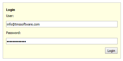
The result becomes:
This is the basic look and feel without CSS.
Now, lets bring bootstrap CSS and some custom CSS in the game and see the new look and feel.
Bootstrap is introduced with adding
<link rel="stylesheet" href="https://maxcdn.bootstrapcdn.com/bootstrap/3.3.7/css/bootstrap.min.css">
to the project HTML file and in addition we add CSS in the project HTML file <STYLE> section to control the LoginPanel look & feel:
<style>
    .labelcenter {
      text-align: center;
    }
    .loginpanel {
      padding: 15px;
    }
    .loginpanelelement {
      margin-top: 2px;
      margin-bottom: 2px;
    }
</style>
Now the appearance of the panel becomes: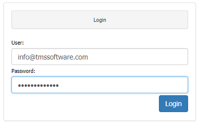
We have only scratched the surface here of the many possibilities to enrich the TMS WEB Core framework with custom UI controls but we hope we have generated interest and enthusiasm.
Get started today: Technical previews of TMS WEB Core, TMS FNC UI web-enabled controls, web-enabled TMS XData, the first parts under the TMS RADical WEB umbrella are exclusively available now for all active TMS-ALL-ACCESS customers.